加载中...
此内容根据文章生成,并经过人工审核,仅用于文章内容的解释与总结
MarkDown语法自带格式
代码块
1
2
3
4
5
6
7
8
9
10
11
12
13
\```shell # VSCode终端 hexo clean; hexo s hexo clean; hexo g; hexo d git add .; git commit -m "npm publish"; npm version patch; git push # Cmder终端 hexo clean && hexo s hexo clean && hexo g && hexo d git add . && git commit -m "npm publish" && npm version patch git push \```
1
2
3
4
5
6
7
8
9
10
11
# VSCode终端 hexo clean; hexo s hexo clean; hexo g; hexo d git add .; git commit -m "npm publish"; npm version patch; git push # Cmder终端 hexo clean && hexo s hexo clean && hexo g && hexo d git add . && git commit -m "npm publish" && npm version patch git push
多级标题
1
2
3
4
5
6
# H1 ## H2 ### H3 #### H4 ##### H5 ##### H6
文字样式
1 2 3 4 5 6 7 8 9 10 11 12 13 14 15 <u > </u > 文字**加粗** 演示 文字*斜体* 演示 文本`高亮` 演示 文本~~删除~~线演示 <font size = 5 > </font > <font face ="黑体" > </font > <font color =blue > </font > <table > <tr > <td bgcolor =MistyRose > </td > </tr > </table >
下划线演示
文字加粗 演示
文字斜体 演示
文本高亮演示
文本删除 线演示
5号字 黑体 蓝色
这里的背景色是:MistyRosen,此处输入任意想输入的内容
引用
1
2
3
4
5
6
7
8
9
10
> Java > 二级引用演示 > MySQL > >外键 > > > >事务 > > > >**行级锁** (引用内部一样可以用格式) > > ....
文字引用链接
Java
外键
事务
行级锁 (引用内部一样可以用格式)
…
分割线
列表(*,+,-跟空格都可以)
无序列表
1 2 3 4 5 6 7 8 9 10 11 * Java* Python* ...+ Java+ Python+ ...- Java- Python- ...
有序列表
1 2 3 4 5 # 注意后面有空格 1. 2. 3. 4.
图片
1 2 3 4 # 本地图片 <img src ="/assets/pusheencode.webp" alt ="示例图片" style ="zoom:50%;" /> # 在线图片 
表格
1 2 3 4 5 | 项目标号 | 资金 | 备注 | | -------- | -------- | ---- | | 1 | 100,000 | 无 | | 2 | 200,000 | 无 | | 3 | 300,600 | 重要 |
项目标号
资金
备注
1
100,000
无
2
200,000
无
3
300,600
重要
公式
1 2 3 $$ \Gamma(z)=\int_0^\infty t^{z-1}e^{-t}dt. $$
$$
Butterfly外挂标签
行内文本样式text
1 2 3 4 5 6 {% u 文本内容 %} {% emp 文本内容 %} {% wavy 文本内容 %} {% del 文本内容 %} {% kbd 文本内容 %} {% psw 文本内容 %}
1 2 3 4 5 6 1. 带 {% u 下划线 %} 的文本2. 带 {% emp 着重号 %} 的文本3. 带 {% wavy 波浪线 %} 的文本4. 带 {% del 删除线 %} 的文本5. 键盘样式的文本 {% kbd command %} + {% kbd D %}6. 密码样式的文本:{% psw 这里没有验证码 %}
带 下划线 的文本
带 着重号 的文本
带 波浪线 的文本
带 删除线 的文本
键盘样式的文本 command + D
密码样式的文本:这里没有验证码
行内文本span
1 {% span 样式参数(参数以空格划分), 文本内容 %}
字体: logo, code
颜色: red,yellow,green,cyan,blue,gray
大小: small, h4, h3, h2, h1, large, huge, ultra
对齐方向: left, center, right
1 2 3 4 5 6 - 彩色文字在一段话中方便插入各种颜色的标签,包括:{% span red, 红色 %}、{% span yellow, 黄色 %}、{% span green, 绿色 %}、{% span cyan, 青色 %}、{% span blue, 蓝色 %}、{% span gray, 灰色 %}。 - 超大号文字文档「开始」页面中的标题部分就是超大号文字。 {% span center logo large, Volantis %} {% span center small, A Wonderful Theme for Hexo %}
彩色文字红色 、黄色 、绿色 、青色 、蓝色 、灰色 。
超大号文字Volantis A Wonderful Theme for Hexo
段落文本P
1 {% p 样式参数(参数以空格划分), 文本内容 %}
字体: logo, code
颜色: red,yellow,green,cyan,blue,gray
大小: small, h4, h3, h2, h1, large, huge, ultra
对齐方向: left, center, right
1 2 3 4 5 6 - 彩色文字在一段话中方便插入各种颜色的标签,包括:{% p red, 红色 %}、{% p yellow, 黄色 %}、{% p green, 绿色 %}、{% p cyan, 青色 %}、{% p blue, 蓝色 %}、{% p gray, 灰色 %}。 - 超大号文字文档「开始」页面中的标题部分就是超大号文字。 {% p center logo large, Volantis %} {% p center small, A Wonderful Theme for Hexo %}
彩色文字红色
、黄色
、绿色
、青色
、蓝色
、灰色
。
超大号文字
Volantis
A Wonderful Theme for Hexo
引用note
最新版butterfly标签支持引用fontawesome V5图标,效果上已经优于volantis的note标签。故不再额外引入volantis的note样式。做样式适配好麻烦的啊,能偷懒就偷懒吧
1 2 3 4 5 6 7 8 9 10 11 12 note: style: simple icons: false border_radius: 3 light_bg_offset: 0
方法一
1 2 3 {% note [class] [no-icon] [style] %} Any content (support inline tags too.io). {% endnote %}
方法二
1 2 3 {% note [color] [icon] [style] %} Any content (support inline tags too.io). {% endnote %}
方法一
参数 用法 class 【可选】标识,不同的标识有不同的配色( default / primary / success / info / warning / danger ) no-icon 【可选】不显示 icon style 【可选】可以覆盖配置中的 style(simple/modern/flat/disabled)
方法二
参数 用法 class 【可选】标识,不同的标识有不同的配色( default / blue / pink / red / purple / orange / green ) no-icon 【可选】可配置自定义 icon (只支持 fontawesome 图标, 也可以配置 no-icon ) style 【可选】可以覆盖配置中的 style(simple/modern/flat/disabled)
方法一
simple样式 1 2 3 4 5 6 7 8 9 10 11 12 13 {% note simple %}默认 提示块标签{% endnote %} {% note default simple %}default 提示块标签{% endnote %} {% note primary simple %}primary 提示块标签{% endnote %} {% note success simple %}success 提示块标签{% endnote %} {% note info simple %}info 提示块标签{% endnote %} {% note warning simple %}warning 提示块标签{% endnote %} {% note danger simple %}danger 提示块标签{% endnote %}
modern样式 1 2 3 4 5 6 7 8 9 10 11 12 13 {% note modern %}默认 提示块标签{% endnote %} {% note default modern %}default 提示块标签{% endnote %} {% note primary modern %}primary 提示块标签{% endnote %} {% note success modern %}success 提示块标签{% endnote %} {% note info modern %}info 提示块标签{% endnote %} {% note warning modern %}warning 提示块标签{% endnote %} {% note danger modern %}danger 提示块标签{% endnote %}
flat样式 1 2 3 4 5 6 7 8 9 10 11 12 13 {% note flat %}默认 提示块标签{% endnote %} {% note default flat %}default 提示块标签{% endnote %} {% note primary flat %}primary 提示块标签{% endnote %} {% note success flat %}success 提示块标签{% endnote %} {% note info flat %}info 提示块标签{% endnote %} {% note warning flat %}warning 提示块标签{% endnote %} {% note danger flat %}danger 提示块标签{% endnote %}
disabled样式 1 2 3 4 5 6 7 8 9 10 11 12 13 {% note disabled %}默认 提示块标签{% endnote %} {% note default disabled %}default 提示块标签{% endnote %} {% note primary disabled %}primary 提示块标签{% endnote %} {% note success disabled %}success 提示块标签{% endnote %} {% note info disabled %}info 提示块标签{% endnote %} {% note warning disabled %}warning 提示块标签{% endnote %} {% note danger disabled %}danger 提示块标签{% endnote %}
no-icon样式 1 2 3 4 5 6 7 8 9 10 11 12 13 {% note no-icon %}默认 提示块标签{% endnote %} {% note default no-icon %}default 提示块标签{% endnote %} {% note primary no-icon %}primary 提示块标签{% endnote %} {% note success no-icon %}success 提示块标签{% endnote %} {% note info no-icon %}info 提示块标签{% endnote %} {% note warning no-icon %}warning 提示块标签{% endnote %} {% note danger no-icon %}danger 提示块标签{% endnote %}
方法二
simple样式 1 2 3 4 5 6 7 8 9 10 11 12 13 {% note 'fab fa-cc-visa' simple %}你是刷 Visa 还是 UnionPay{% endnote %} {% note blue 'fas fa-bullhorn' simple %}2021年快到了....{% endnote %} {% note pink 'fas fa-car-crash' simple %}小心开车 安全至上{% endnote %} {% note red 'fas fa-fan' simple%}这是三片呢?还是四片?{% endnote %} {% note orange 'fas fa-battery-half' simple %}你是刷 Visa 还是 UnionPay{% endnote %} {% note purple 'far fa-hand-scissors' simple %}剪刀石头布{% endnote %} {% note green 'fab fa-internet-explorer' simple %}前端最讨厌的浏览器{% endnote %}
modern样式 1 2 3 4 5 6 7 8 9 10 11 12 13 {% note 'fab fa-cc-visa' modern %}你是刷 Visa 还是 UnionPay{% endnote %} {% note blue 'fas fa-bullhorn' modern %}2021年快到了....{% endnote %} {% note pink 'fas fa-car-crash' modern %}小心开车 安全至上{% endnote %} {% note red 'fas fa-fan' modern%}这是三片呢?还是四片?{% endnote %} {% note orange 'fas fa-battery-half' modern %}你是刷 Visa 还是 UnionPay{% endnote %} {% note purple 'far fa-hand-scissors' modern %}剪刀石头布{% endnote %} {% note green 'fab fa-internet-explorer' modern %}前端最讨厌的浏览器{% endnote %}
flat样式 1 2 3 4 5 6 7 8 9 10 11 12 13 {% note 'fab fa-cc-visa' modern %}你是刷 Visa 还是 UnionPay{% endnote %} {% note blue 'fas fa-bullhorn' modern %}2021年快到了....{% endnote %} {% note pink 'fas fa-car-crash' modern %}小心开车 安全至上{% endnote %} {% note red 'fas fa-fan' modern%}这是三片呢?还是四片?{% endnote %} {% note orange 'fas fa-battery-half' modern %}你是刷 Visa 还是 UnionPay{% endnote %} {% note purple 'far fa-hand-scissors' modern %}剪刀石头布{% endnote %} {% note green 'fab fa-internet-explorer' modern %}前端最讨厌的浏览器{% endnote %}
disabled样式 1 2 3 4 5 6 7 8 9 10 11 12 13 {% note 'fab fa-cc-visa' disabled %}你是刷 Visa 还是 UnionPay{% endnote %} {% note blue 'fas fa-bullhorn' disabled %}2021年快到了....{% endnote %} {% note pink 'fas fa-car-crash' disabled %}小心开车 安全至上{% endnote %} {% note red 'fas fa-fan' disabled %}这是三片呢?还是四片?{% endnote %} {% note orange 'fas fa-battery-half' disabled %}你是刷 Visa 还是 UnionPay{% endnote %} {% note purple 'far fa-hand-scissors' disabled %}剪刀石头布{% endnote %} {% note green 'fab fa-internet-explorer' disabled %}前端最讨厌的浏览器{% endnote %}
no-icon样式 1 2 3 4 5 6 7 8 9 10 11 12 13 {% note no-icon %}你是刷 Visa 还是 UnionPay{% endnote %} {% note blue no-icon %}2021年快到了....{% endnote %} {% note pink no-icon %}小心开车 安全至上{% endnote %} {% note red no-icon %}这是三片呢?还是四片?{% endnote %} {% note orange no-icon %}你是刷 Visa 还是 UnionPay{% endnote %} {% note purple no-icon %}剪刀石头布{% endnote %} {% note green no-icon %}前端最讨厌的浏览器{% endnote %}
方法一
simple样式 modern样式 flat样式 disabled样式 no-icon样式
方法二
simple样式 modern样式 flat样式 disabled样式 no-icon样式
上标标签tip
1 {% tip [参数,可选] %}文本内容{% endtip %}
样式: success,error,warning,bolt,ban,home,sync,cogs,key,bell
自定义图标: 支持fontawesome。
1 2 3 4 5 6 7 8 9 10 11 12 13 {% tip %}default{% endtip %} {% tip info %}info{% endtip %} {% tip success %}success{% endtip %} {% tip error %}error{% endtip %} {% tip warning %}warning{% endtip %} {% tip bolt %}bolt{% endtip %} {% tip ban %}ban{% endtip %} {% tip home %}home{% endtip %} {% tip sync %}sync{% endtip %} {% tip cogs %}cogs{% endtip %} {% tip key %}key{% endtip %} {% tip bell %}bell{% endtip %} {% tip fa-atom %}自定义font awesome图标{% endtip %}
动态标签anima
动态标签的实质是引用了font-awesome-animation的css样式,不一定局限于tip标签,也可以是其他标签。
1 {% tip [参数,可选] %}文本内容{% endtip %}
更多详情请参看font-awesome-animation 文档
将所需的CSS类添加到图标(或DOM中的任何元素)。
对于父级悬停样式,需要给目标元素添加指定CSS类,同时还要给目标元素的父级元素添加CSS类faa-parent animated-hover。(详情见示例及示例源码)
可以通过给目标元素添加CSS类faa-fast或faa-slow来控制动画快慢。
On DOM load 当页面加载时 显示动画
On hover 当鼠标悬停时 显示动画
On parent hover 当鼠标悬停 在父级元素时 显示动画
On DOM load(当页面加载时显示动画)
1 2 {% tip warning faa-horizontal animated %}warning{% endtip %} {% tip ban faa-flash animated %}ban{% endtip %}
调整动画速度
1 2 {% tip warning faa-horizontal animated faa-fast %}warning{% endtip %} {% tip ban faa-flash animated faa-slow %}ban{% endtip %}
On hover(当鼠标悬停时显示动画)
1 2 {% tip warning faa-horizontal animated-hover %}warning{% endtip %} {% tip ban faa-flash animated-hover %}ban{% endtip %}
On parent hover(当鼠标悬停在父级元素时显示动画)
1 2 {% tip warning faa-parent animated-hover %}<p class ="faa-horizontal" > </p > {% tip ban faa-parent animated-hover %}<p class ="faa-flash" > </p >
On DOM load(当页面加载时显示动画)
2. 调整动画速度
3. On hover(当鼠标悬停时显示动画)
4. On parent hover(当鼠标悬停在父级元素时显示动画)
复选列表checkbox
1 {% checkbox 样式参数(可选), 文本(支持简单md) %}
样式: plus, minus, times
颜色: red,yellow,green,cyan,blue,gray
选中状态: checked
1 2 3 4 5 6 7 8 9 10 {% checkbox 纯文本测试 %} {% checkbox checked, 支持简单的 [markdown ](https://guides.github.com/features/mastering-markdown/ ) 语法 %} {% checkbox red, 支持自定义颜色 %} {% checkbox green checked, 绿色 + 默认选中 %} {% checkbox yellow checked, 黄色 + 默认选中 %} {% checkbox cyan checked, 青色 + 默认选中 %} {% checkbox blue checked, 蓝色 + 默认选中 %} {% checkbox plus green checked, 增加 %} {% checkbox minus yellow checked, 减少 %} {% checkbox times red checked, 叉 %}
单选列表radio
1 {% radio 样式参数(可选), 文本(支持简单md) %}
颜色: red,yellow,green,cyan,blue,gray
选中状态: checked
1 2 3 4 5 6 7 {% radio 纯文本测试 %} {% radio checked, 支持简单的 [markdown ](https://guides.github.com/features/mastering-markdown/ ) 语法 %} {% radio red, 支持自定义颜色 %} {% radio green, 绿色 %} {% radio yellow, 黄色 %} {% radio cyan, 青色 %} {% radio blue, 蓝色 %}
时间轴timeline
1 2 3 4 5 6 7 8 {% timeline 时间线标题(可选)[,color] %} <!-- timeline 时间节点(标题) --> 正文内容 <!-- endtimeline --> <!-- timeline 时间节点(标题) --> 正文内容 <!-- endtimeline --> {% endtimeline %}
参数
解释
title
标题/时间线
color
timeline颜色:default(留空) / blue / pink / red / purple / orange / green
1 2 3 4 5 6 7 8 9 10 11 12 13 14 15 16 17 18 19 20 21 22 23 24 25 26 27 {% timeline 时间轴样式,blue %} <!-- timeline 2020-07-24 [2.6.6 -> 3.0 ](https://github.com/volantis-x/hexo-theme-volantis/releases ) --> 1. 如果有 `hexo-lazyload-image` 插件,需要删除并重新安装最新版本,设置 `lazyload.isSPA: true` 。2. 2.x 版本的 css 和 js 不适用于 3.x 版本,如果使用了 `use_cdn: true` 则需要删除。3. 2.x 版本的 fancybox 标签在 3.x 版本中被重命名为 gallery 。4. 2.x 版本的置顶 `top: true` 改为了 `pin: true` ,并且同样适用于 `layout: page` 的页面。5. 如果使用了 `hexo-offline` 插件,建议卸载,3.0 版本默认开启了 pjax 服务。<!-- endtimeline --> <!-- timeline 2020-05-15 [2.6.3 -> 2.6.6 ](https://github.com/volantis-x/hexo-theme-volantis/releases/tag/2.6.6 ) --> 不需要额外处理。 <!-- endtimeline --> <!-- timeline 2020-04-20 [2.6.2 -> 2.6.3 ](https://github.com/volantis-x/hexo-theme-volantis/releases/tag/2.6.3 ) --> 1. 全局搜索 `seotitle` 并替换为 `seo_title` 。2. group 组件的索引规则有变,使用 group 组件的文章内,`group: group_name` 对应的组件名必须是 `group_name` 。2. group 组件的列表名优先显示文章的 `short_title` 其次是 `title` 。<!-- endtimeline --> {% endtimeline %}
如果有 hexo-lazyload-image 插件,需要删除并重新安装最新版本,设置 lazyload.isSPA: true。
2.x 版本的 css 和 js 不适用于 3.x 版本,如果使用了 use_cdn: true 则需要删除。
2.x 版本的 fancybox 标签在 3.x 版本中被重命名为 gallery 。
2.x 版本的置顶 top: true 改为了 pin: true,并且同样适用于 layout: page 的页面。
如果使用了 hexo-offline 插件,建议卸载,3.0 版本默认开启了 pjax 服务。
全局搜索 seotitle 并替换为 seo_title。
group 组件的索引规则有变,使用 group 组件的文章内,group: group_name 对应的组件名必须是 group_name。
group 组件的列表名优先显示文章的 short_title 其次是 title。
卡片链接link
1 {% link 标题, 链接, 图片链接(可选) %}
1 {% link 糖果屋教程贴, https://akilar.top/posts/615e2dec/, https://cdn.jsdelivr.net/gh/lazyingman/pictureCollection/41.webp %}
按钮btn
1 2 3 4 {% btns 样式参数 %} {% cell 标题, 链接, 图片或者图标 %} {% cell 标题, 链接, 图片或者图标 %} {% endbtns %}
圆角样式:rounded, circle
增加文字样式:可以在容器内增加 标题 和描述文字
布局方式:
如果需要显示类似「团队成员」之类的一组含有头像的链接:
1 2 3 4 5 6 7 {% btns circle grid5 %} {% cell xaoxuu, https://xaoxuu.com, https://cdn.jsdelivr.net/gh/xaoxuu/cdn-assets/avatar/avatar.png %} {% cell xaoxuu, https://xaoxuu.com, https://cdn.jsdelivr.net/gh/xaoxuu/cdn-assets/avatar/avatar.png %} {% cell xaoxuu, https://xaoxuu.com, https://cdn.jsdelivr.net/gh/xaoxuu/cdn-assets/avatar/avatar.png %} {% cell xaoxuu, https://xaoxuu.com, https://cdn.jsdelivr.net/gh/xaoxuu/cdn-assets/avatar/avatar.png %} {% cell xaoxuu, https://xaoxuu.com, https://cdn.jsdelivr.net/gh/xaoxuu/cdn-assets/avatar/avatar.png %} {% endbtns %}
或者含有图标的按钮:
1 2 3 4 {% btns rounded grid5 %} {% cell 下载源码, /, fas fa-download %} {% cell 查看文档, /, fas fa-book-open %} {% endbtns %}
圆形图标 + 标题 + 描述 + 图片 + 网格5列 + 居中
1 2 3 4 5 6 7 8 9 10 11 12 13 14 {% btns circle center grid5 %} <a href ='https://apps.apple.com/cn/app/heart-mate-pro-hrm-utility/id1463348922?ls=1' > <i class ='fab fa-apple' > </i > <b > </b > {% p red, 专业版 %} <img src ='https://cdn.jsdelivr.net/gh/xaoxuu/cdn-assets/qrcode/heartmate_pro.png' > </a > <a href ='https://apps.apple.com/cn/app/heart-mate-lite-hrm-utility/id1475747930?ls=1' > <i class ='fab fa-apple' > </i > <b > </b > {% p green, 免费版 %} <img src ='https://cdn.jsdelivr.net/gh/xaoxuu/cdn-assets/qrcode/heartmate_lite.png' > </a > {% endbtns %}
如果需要显示类似「团队成员」之类的一组含有头像的链接:
或者含有图标的按钮:
圆形图标 + 标题 + 描述 + 图片 + 网格5列 + 居中
github徽标 ghbdage
1 {% bdage [right],[left],[logo]||[color],[link],[title]||[option] %}
left:徽标左边的信息,必选参数。
right: 徽标右边的信息,必选参数,
logo:徽标图标,图标名称详见simpleicons,可选参数。
color:徽标右边的颜色,可选参数。
link:指向的链接,可选参数。
title:徽标的额外信息,可选参数。主要用于优化SEO,但object标签不会像a标签一样在鼠标悬停显示title信息。
option:自定义参数,支持shields.io的全部API参数支持,具体参数可以参看上文中的拓展写法示例。形式为name1=value2&name2=value2。
1. 基本参数,定义徽标左右文字和图标
1 2 {% bdage Theme,Butterfly %} {% bdage Frame,Hexo,hexo %}
2. 信息参数,定义徽标右侧内容背景色,指向链接
1 2 3 {% bdage CDN,JsDelivr,jsDelivr||abcdef,https://metroui.org.ua/index.html,本站使用JsDelivr为静态资源提供CDN加速 %} //如果是跨顺序省略可选参数,仍然需要写个逗号,用作分割 {% bdage Source,GitHub,GitHub||,https://github.com/ %}
3. 拓展参数,支持shields的API的全部参数内容
1 2 3 {% bdage Hosted,Vercel,Vercel||brightgreen,https://vercel.com/,本站采用双线部署,默认线路托管于Vercel||style=social&logoWidth=20 %} //如果是跨顺序省略可选参数组,仍然需要写双竖线||用作分割 {% bdage Hosted,Vercel,Vercel||||style=social&logoWidth=20&logoColor=violet %}
基本参数,定义徽标左右文字和图标
信息参数,定义徽标右侧内容背景色,指向链接
拓展参数,支持shields的API的全部参数内容
网站卡片sites
1 2 3 4 {% sitegroup %} {% site 标题, url=链接, screenshot=截图链接, avatar=头像链接(可选), description=描述(可选) %} {% site 标题, url=链接, screenshot=截图链接, avatar=头像链接(可选), description=描述(可选) %} {% endsitegroup %}
1 2 3 4 5 6 7 {% sitegroup %} {% site xaoxuu, url=https://xaoxuu.com, screenshot=https://i.loli.net/2020/08/21/VuSwWZ1xAeUHEBC.jpg, avatar=https://cdn.jsdelivr.net/gh/xaoxuu/cdn-assets/avatar/avatar.png%} {% site inkss, url=https://inkss.cn, screenshot=https://i.loli.net/2020/08/21/Vzbu3i8fXs6Nh5Y.jpg, avatar=https://cdn.jsdelivr.net/gh/xaoxuu/cdn-assets/avatar/avatar.png%} {% site MHuiG, url=https://blog.mhuig.top, screenshot=https://i.loli.net/2020/08/22/d24zpPlhLYWX6D1.png, avatar=https://cdn.jsdelivr.net/gh/xaoxuu/cdn-assets/avatar/avatar.png%} {% site Colsrch, url=https://colsrch.top, screenshot=https://i.loli.net/2020/08/22/dFRWXm52OVu8qfK.png, avatar=https://cdn.jsdelivr.net/gh/Colsrch/images/Colsrch/avatar.jpg%} {% site Linhk1606, url=https://linhk1606.github.io, screenshot=https://i.loli.net/2020/08/21/3PmGLCKicnfow1x.png, avatar=https://i.loli.net/2020/02/09/PN7I5RJfFtA93r2.png %} {% endsitegroup %}
行内图片 inlineimage
1 {% inlineimage 图片链接, height=高度(可选) %}
1 2 3 这是 {% inlineimage https://cdn.jsdelivr.net/gh/volantis-x/cdn-emoji/aru-l/0000.gif %} 一段话。 这又是 {% inlineimage https://cdn.jsdelivr.net/gh/volantis-x/cdn-emoji/aru-l/5150.gif, height=40px %} 一段话。
这是
这又是
单张图片image
1 {% image 链接, width=宽度(可选), height=高度(可选), alt=描述(可选), bg=占位颜色(可选) %}
图片宽度高度:width=300px, height=32px
图片描述:alt=图片描述(butterfly需要在主题配置文件中开启图片描述)
占位背景色:bg=#f2f2f2
添加描述:
1 {% image https://cdn.jsdelivr.net/gh/volantis-x/cdn-wallpaper-minimalist/2020/025.jpg, alt=每天下课回宿舍的路,没有什么故事。 %}
指定宽度:
1 {% image https://cdn.jsdelivr.net/gh/volantis-x/cdn-wallpaper-minimalist/2020/025.jpg, width=400px %}
指定宽度并添加描述:
1 {% image https://cdn.jsdelivr.net/gh/volantis-x/cdn-wallpaper-minimalist/2020/025.jpg, width=400px, alt=每天下课回宿舍的路,没有什么故事。 %}
设置占位背景色:
1 {% image https://cdn.jsdelivr.net/gh/volantis-x/cdn-wallpaper-minimalist/2020/025.jpg, width=400px, bg=#1D0C04, alt=优化不同宽度浏览的观感 %}
添加描述:
指定宽度:
指定宽度并添加描述:
设置占位背景色:
音频audio
1 {% audio https://github.com/volantis-x/volantis-docs/releases/download/assets/Lumia1020.mp3 %}
Your browser does not support the audio tag. 视频video
对其方向:left, center, right
列数:逗号后面直接写列数,支持 1 ~ 4 列。
100%宽度
50%宽度
1 2 3 4 5 6 {% videos, 2 %} {% video # %} {% video # %} {% video # %} {% video # %} {% endvideos %}
25%宽度
1 2 3 4 5 6 7 8 9 10 {% videos, 4 %} {% video # %} {% video # %} {% video # %} {% video # %} {% video # %} {% video # %} {% video # %} {% video # %} {% endvideos %}
100%宽度
Your browser does not support the video tag.
50%宽度
Your browser does not support the video tag.
Your browser does not support the video tag.
Your browser does not support the video tag.
Your browser does not support the video tag.
25%宽度
Your browser does not support the video tag.
Your browser does not support the video tag.
Your browser does not support the video tag.
Your browser does not support the video tag.
Your browser does not support the video tag.
Your browser does not support the video tag.
Your browser does not support the video tag.
Your browser does not support the video tag.
相册gallery
Butterfly自带gallery相册,而且会根据图片大小自动调整排版,效果比Volantis的gallery更好,故不再收录Volantis的gallery标签。
以下为Butterfly自带的gallery标签写法。相册图库和相册配合使用。
gallerygroup 相册图库
1 2 3 4 5 <div class ="gallery-group-main" > {% galleryGroup name description link img-url %} {% galleryGroup name description link img-url %} {% galleryGroup name description link img-url %} </div >
gallery 相册
1 2 3 {% gallery %} markdown 圖片格式 {% endgallery %}
gallerygroup 相册图库
参数名
释义
name
图库名字
description
图库描述
link
链接到对应相册的地址
img-url
图库封面
思维拓展一下,相册图库的实质其实就是个快捷方式,可以自定义添加描述、封面、链接。那么我们未必要把它当做一个相册,完全可以作为一个链接卡片,链接到视频、QQ、友链都是不错的选择。
gallery 相册
区别于旧版的Gallery相册,新的Gallery相册会自动根据图片长度进行排版,书写也更加方便,与markdown格式一样。可根据需要插入到相应的md。无需再自己配置长宽。建议在粘贴时故意使用长短、大小、横竖不一的图片,会有更好的效果。(尺寸完全相同的图片只会平铺输出,效果很糟糕)
gallerygroup 相册图库
1 2 3 4 5 <div class ="gallery-group-main" > {% galleryGroup MC 在Rikkaの六花服务器里留下的足迹 '/gallery/MC/' https://npm.elemecdn.com/akilar-candyassets/image/1.jpg %} {% galleryGroup Gundam 哦咧哇gundam哒! '/gallery/Gundam/' https://npm.elemecdn.com/akilar-candyassets/image/20200907110508327.png %} {% galleryGroup I-am-Akilar 某种意义上也算自拍吧 '/gallery/I-am-Akilar/' https://npm.elemecdn.com/akilar-candyassets/image/20200907113116651.png %} </div >
gallery 相册
1 2 3 4 5 6 7 8 9 10 {% gallery %}         {% endgallery %}
gallerygroup 相册图库
World
世界各地风景
Gundam
哦咧哇gundam哒!
gallery 相册
[{"url":"https://i.loli.net/2019/12/25/Fze9jchtnyJXMHN.jpg","alt":""},{"url":"https://i.loli.net/2019/12/25/ryLVePaqkYm4TEK.jpg","alt":""},{"url":"https://i.loli.net/2019/12/25/gEy5Zc1Ai6VuO4N.jpg","alt":""},{"url":"https://i.loli.net/2019/12/25/d6QHbytlSYO4FBG.jpg","alt":""},{"url":"https://i.loli.net/2019/12/25/6nepIJ1xTgufatZ.jpg","alt":""},{"url":"https://i.loli.net/2019/12/25/E7Jvr4eIPwUNmzq.jpg","alt":""},{"url":"https://i.loli.net/2019/12/25/mh19anwBSWIkGlH.jpg","alt":""},{"url":"https://i.loli.net/2019/12/25/2tu9JC8ewpBFagv.jpg","alt":""}]
加载更多
折叠框 folding
1 2 3 {% folding 参数(可选), 标题 %}  {% endfolding %}
颜色:blue, cyan, green, yellow, red
状态:状态填写 open 代表默认打开。
1 2 3 4 5 6 7 8 9 10 11 12 13 14 15 16 17 18 19 20 21 22 23 24 25 26 27 28 29 30 31 32 33 34 35 36 {% folding 查看图片测试 %}  {% endfolding %} {% folding cyan open, 查看默认打开的折叠框 %} 这是一个默认打开的折叠框。 {% endfolding %} {% folding green, 查看代码测试 %} 假装这里有代码块(代码块没法嵌套代码块) {% endfolding %} {% folding yellow, 查看列表测试 %} - haha- hehe{% endfolding %} {% folding red, 查看嵌套测试 %} {% folding blue, 查看嵌套测试2 %} {% folding 查看嵌套测试3 %} hahaha <span > <img src ='https://cdn.jsdelivr.net/gh/volantis-x/cdn-emoji/tieba/%E6%BB%91%E7%A8%BD.png' style ='height:24px' > </span > {% endfolding %} {% endfolding %} {% endfolding %}
查看图片测试
查看默认打开的折叠框
查看代码测试
查看列表测试
查看嵌套测试
查看嵌套测试2 查看嵌套测试3 hahaha
分栏tab
1 2 3 4 5 {% tabs Unique name, [index] %} <!-- tab [Tab caption] [@icon] --> Any content (support inline tags too). <!-- endtab --> {% endtabs %}
Unique name :
选项卡块标签的唯一名称,不带逗号。
将在#id中用作每个标签及其索引号的前缀。
如果名称中包含空格,则对于生成#id,所有空格将由破折号代替。
仅当前帖子/页面的URL必须是唯一的!
[index]:
活动选项卡的索引号。
如果未指定,将选择第一个标签(1)。
如果index为-1,则不会选择任何选项卡。
可选参数。
[Tab caption]:
当前选项卡的标题。
如果未指定标题,则带有制表符索引后缀的唯一名称将用作制表符的标题。
如果未指定标题,但指定了图标,则标题将为空。
可选参数。
[@icon]:
FontAwesome图标名称(全名,看起来像“ fas fa-font”)
可以指定带空格或不带空格;
例如’Tab caption @icon’ 和 ‘Tab caption@icon’.
可选参数。
1 2 3 4 5 6 7 8 9 10 11 12 13 {% tabs test1 %} <!-- tab --> **This is Tab 1.** <!-- endtab --> <!-- tab --> **This is Tab 2.** <!-- endtab --> <!-- tab --> **This is Tab 3.** <!-- endtab --> {% endtabs %}
1
2
3
4
5
6
7
8
9
10
11
12
13
{% tabs test2, 3 %} <!-- tab --> **This is Tab 1.** <!-- endtab --> <!-- tab --> **This is Tab 2.** <!-- endtab --> <!-- tab --> **This is Tab 3.** <!-- endtab --> {% endtabs %}
1
2
3
4
5
6
7
8
9
10
11
12
13
{% tabs test3, -1 %} <!-- tab --> **This is Tab 1.** <!-- endtab --> <!-- tab --> **This is Tab 2.** <!-- endtab --> <!-- tab --> **This is Tab 3.** <!-- endtab --> {% endtabs %}
Demo 4 - 自定义Tab名 + 只有icon + icon和Tab名
1
2
3
4
5
6
7
8
9
10
11
12
13
{% tabs test4 %} <!-- tab 第一个Tab --> **tab名字为第一个Tab** <!-- endtab --> <!-- tab @fab fa-apple-pay --> **只有图标 没有Tab名字** <!-- endtab --> <!-- tab 炸弹@fas fa-bomb --> **名字+icon** <!-- endtab --> {% endtabs %}
数据集合 issues
1 {% issues type | api=url | group=key:value1,value2(可选) %}
type(类型):
根据需求不同,会将 issues 内容解析成不同的 HTML 标签,目前支持的类型有:
1. 时间轴timeline: 解析成timeline标签,issue的标题对应timeline的时间,issue的内容对应timeline的内容。
2. 网站卡片sites: 解析成sites标签,需要有JSON代码块,各参数对应sites标签参数:
1 2 3 4 5 6 7 8 { "title" : "" , "screenshot" : "" , "url" : "" , "avatar" : "" , "description" : "" , "「keywords」" : "" }
参数
释义
title
网站名称
screenshot
网站预览图
url
网站链接,需要添加 https://协议组成完整域名 。
avatar
站长头像
「keywords」
分组依据
api(接口):
url为可以调的通的API,例如:
1 2 api=https://gi tee.com/api/ v5/repos/ xaoxuu/friends/i ssues?sort=updated&state=open&page=1 &per_page=100 &labels=active api=https:// api.github.com/repos/ xaoxuu/friends/i ssues?sort=updated&state=open&page=1 &per_page=100 &labels=active
参数
释义
https://gitee.com/api/v5/ gitee仓库的api
https://api.github.com/ github仓库的api
repos/xaoxuu/friends/issues
repos/用户名/仓库名/issues
repos/用户名/仓库名/issues
界定哪些类型的issues会被读取过来渲染成相应的标签
page=1&per_page=100
读取前100条issues
labels=active
控制默认的issue不显示,只有自己审核通过添加了active标签之后才会显示
时间轴标签timeline渲染
1 {% issues timeline | api=https://gitee.com/api/v5/repos/xaoxuu/timeline/issues?state=open&creator=xaoxuu&sort=created&direction=desc&page=1&per_page=100 %}
网站卡片标签sites渲染
gitee仓库示例1 {% issues sites | api=https://gitee.com/api/v5/repos/xaoxuu/friends/issues?sort=updated&state=open&page=1&per_page=100&labels=active %}
github仓库示例1 {% issues sites | api=https://api.github.com/repos/xaoxuu/friends/issues?sort=updated&state=open&page=1&per_page=100&labels=active %}
网站卡片标签sites分组渲染
1 {% issues sites | api=https://api.github.com/repos/volantis-x/examples/issues?sort=updated&state=open&page=1&per_page=100 | group=version:版本:^4.0,版本:^3.0,版本:^2.0 %}
时间轴标签timeline渲染
网站卡片标签sites渲染
网站卡片标签sites分组渲染
诗词标签 poem
1 2 3 {% poem [title],[author] %} 诗词内容 {% endpoem %}
title:诗词标题
author:作者,可以不写
1 2 3 4 5 6 7 8 9 10 11 12 {% poem 水调歌头,苏轼 %} 丙辰中秋,欢饮达旦,大醉,作此篇,兼怀子由。 明月几时有?把酒问青天。 不知天上宫阙,今夕是何年? 我欲乘风归去,又恐琼楼玉宇,高处不胜寒。 起舞弄清影,何似在人间? 转朱阁,低绮户,照无眠。 不应有恨,何事长向别时圆? 人有悲欢离合,月有阴晴圆缺,此事古难全。 但愿人长久,千里共婵娟。 {% endpoem %}
水调歌头
苏轼
明月几时有?把酒问青天。
转朱阁,低绮户,照无眠。
进度条 progress
1 {% progress [width] [color] [text] %}
width: 0到100的阿拉伯数字
1 2 3 4 5 6 {% progress 10 red 进度条样式预览 %} {% progress 30 yellow 进度条样式预览 %} {% progress 50 green 进度条样式预览 %} {% progress 70 cyan 进度条样式预览 %} {% progress 90 blue 进度条样式预览 %} {% progress 100 gray 进度条样式预览 %}
气泡注释 bubble
1 {% bubble [content] , [notation] ,[background-color] %}
content: 注释词汇
1 最近我学到了不少新玩意儿(虽然对很多大佬来说这些已经是旧技术了),比如CSS的{% bubble 兄弟相邻选择器,"例如 h1 + p {margin-top:50px;}" %},{% bubble flex布局,"Flex 是 Flexible Box 的缩写,意为"弹性布局",用来为盒状模型提供最大的灵活性","#ec5830" %},{% bubble transform变换,"transform 属性向元素应用 2D 或 3D 转换。该属性允许我们对元素进行旋转、缩放、移动或倾斜。","#1db675" %},animation的{% bubble 贝塞尔速度曲线,"贝塞尔曲线(Bézier curve),又称贝兹曲线或贝济埃曲线,是应用于二维图形应用程序的数学曲线。一般的矢量图形软件通过它来精确画出曲线,贝兹曲线由线段与节点组成,节点是可拖动的支点,线段像可伸缩的皮筋","#de4489" %}写法,还有今天刚看到的{% bubble clip-path,"clip-path属性使用裁剪方式创建元素的可显示区域。区域内的部分显示,区域外的隐藏。","#868fd7" %}属性。这些对我来说很新颖的概念狠狠的冲击着我以前积累起来的设计思路。
最近我学到了不少新玩意儿(虽然对很多大佬来说这些已经是旧技术了),比如CSS的兄弟相邻选择器 例如 h1 + p {margin-top:50px;} flex布局 Flex 是 Flexible Box 的缩写,意为弹性布局",用来为盒状模型提供最大的灵活性" transform变换 transform 属性向元素应用 2D 或 3D 转换。该属性允许我们对元素进行旋转、缩放、移动或倾斜。 贝塞尔速度曲线 贝塞尔曲线(Bézier curve),又称贝兹曲线或贝济埃曲线,是应用于二维图形应用程序的数学曲线。一般的矢量图形软件通过它来精确画出曲线,贝兹曲线由线段与节点组成,节点是可拖动的支点,线段像可伸缩的皮筋 clip-path clip-path属性使用裁剪方式创建元素的可显示区域。区域内的部分显示,区域外的隐藏。
旋转相册 carousel
1 2 3 4 5 {% carousel [Id] , [name] %}    {% endcarousel %}
Id: 相册唯一ID,用于监测相册鼠标动作。禁止使用中文。同一页内不得出现相同ID的carousel相册。
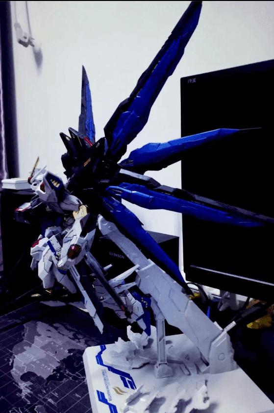
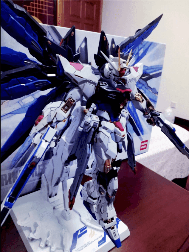
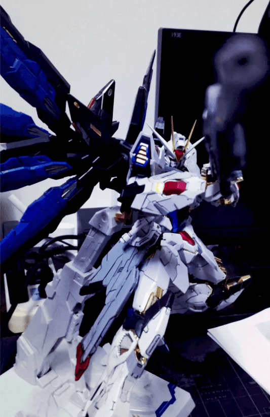
1 2 3 4 5 6 7 8 9 10 11 12 {% carousel 'SF','strike freedom' %}  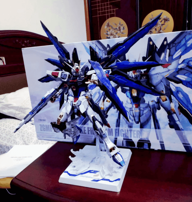 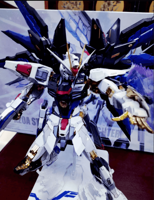 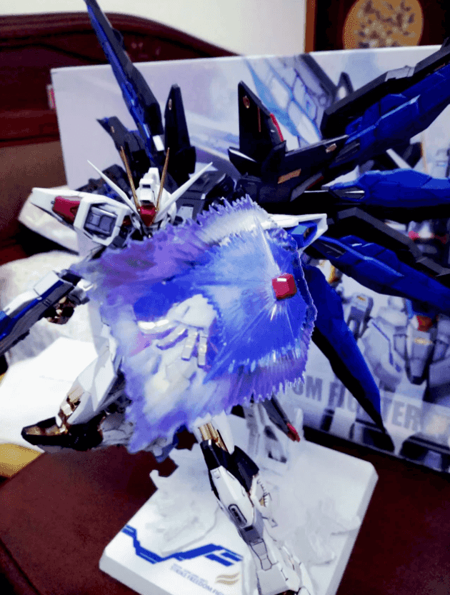 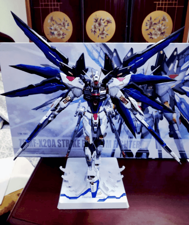     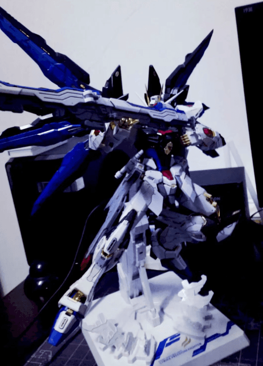 {% endcarousel %}
mermaid图
使用mermaid标签可以绘制Flowchart(流程图)、Sequence diagram(时序图 )、Class Diagram(类别图)、State Diagram(状态图)、Gantt(甘特图)和Pie Chart(圆形图),具体可以查看mermaid 文档
1 {% checkbox 样式参数(可选), 文本(支持简单md) %}
1 2 3 4 5 6 7 8 {% mermaid %} pie title Key elements in Product X "Calcium" : 42.96 "Potassium" : 50.05 "Magnesium" : 10.01 "Iron" : 5 {% endmermaid %}
  pie
    title Key elements in Product X
    "Calcium" : 42.96
    "Potassium" : 50.05
    "Magnesium" : 10.01
    "Iron" :  5


 xaoxuu


 一段话。
一段话。 一段话。
一段话。